Tori Flower is Creative Director of Shift (formerly We Are What We Do), a behaviour change organisation that designs products for social change. She also set the RSA Student Design Awards 'Everyday Well-being' brief in 2013-14 and 'The Daily Diet' brief this year. In a series of seven short blogs aimed at student designers released each day this week, she shares her insights into how to approach designing for behaviour change.
Tip 5: Test, iterate, improve your solutions
In my previous blogs, I recommended you should:
Identify the Outcome, Action and Actor
Identify Barriers and Motivations
Design interventions that facilitate, not communicate
Design around behavioural insights
In this blog I am going to talk about how to test, iterate, improve your solutions.
It is useful for every designer to get feedback on their work from their future users, but it is crucial for behaviour change designers.
Look back on my blog on Designing interventions that facilitate, not communicate. Remember it is not good enough in behaviour change to raise awareness of an issue – to be successful you actually have to get the Actor to do the Action.
To test your success, you need to find out:
-
Does your intervention facilitate your Action successfully?
-
Does it appeal to your Actor?
-
Are there any barriers to using it that would prevent uptake?
Useful tools

There are lots of existing design tools to help you do this well. I have found these resources useful:
-
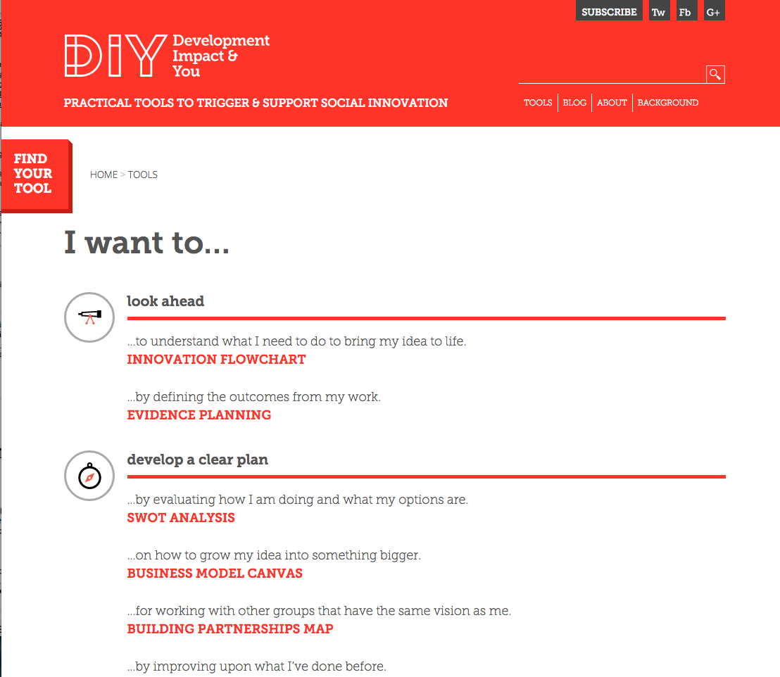
Nesta’s DIY Toolkit – Look in the “Test and Improve” section.
-
Ideo.org’s Design Kit – Look in the "Ideation" and "Implementation" sections, particularly around prototyping and iterating.
-
The Design Council’s Design Methods – Look in the “Develop Phase” section
-
The Design Council’s document on Design Methods for Developing Services
Your target audience
Whilst it's interesting to see what your fellow students and tutors think of the ideas, it’s much more important to see how your idea will appeal to people who fit the profile of the Actor you are designing for.
Test early
It’s key to test your interventions early in the design process. I see a lot of students who, once they have an idea, jump to the Photoshopping-up stage and start thinking of names, slogans and visual identities before they’ve got a really good concept.
It’s hard to throw away an idea if you’ve spent ages working on it and it’s tricky for your testing group to judge if the idea is good, if they get distracted by the detail of something too polished.
I usually just get students to create A3 sheets with a simple drawing and a descriptor of no more than 10 words for each of their ideas in the first instance and get feedback on this before they take it forward.
Test several ideas
My teacher at art college used to say coming up with a good idea is like taking shots at a goal – the more balls you kick, the more likely it is that one will go in. So don’t stop at your first idea (or even second or third). Having multiple ideas to test means you won’t mind if several of them are not deemed worthwhile.
Testing if you have access to your target audience
The “Rapid Prototyping” and “Get Feedback” exercises in the IDEO design kit explain how to test your idea with your user - including great tips like “Invite honesty and openness” and “Stay neutral”.
The book Interviewing for research by Andrew Travers is also really great and has lots of good tips like “Prepare interviewees properly,” and “Don’t lead, don’t close”.
Testing if you don’t have access to your target audience after your earlier research phase
Sometimes you may have gathered some great insights from your target audience in your research phase but can’t get access to these people again. This isn’t a disaster- you can use these insights to still test your ideas.
This approach is used in some of the methods in the “Develop Phase” section Design Council’s Design Methods.
For example:
-
Character profiles - A way to create simple character sketches and visual representations of the most important categories of user you are designing for.
-
Scenarios - Detailed accounts of situations in which your users will interact with your product or service over a period of time.
-
Role playing - Physically acting out what happens where users interact with products or services.
-
Blueprinting - A service blueprint is a detailed visual representation of the total service over time - showing the user’s journey, all the different touchpoints and channels, as well as the behind the scenes parts of a service that make it work.
React
Make sure you capture the feedback properly. Afterwards you can analyse what you learnt, cluster the feedback, prioritise what’s important to alter and iterate your prototype before testing again.
Keep testing
Get used to using these tools to test and interrogate your idea over and over again within the design process, as this will improve your intervention.
Actually making something and seeing how it works in practice and how popular it is can highlight issues that don’t arise if you are just testing a concept.
People doing it well: student example

When Lizzie Reid and Olivia Charlesworth (RSA Design Award winners 2014) tested their idea for an alarm clock app in which users select songs for other people to wake them up (aimed at giving them a positive start to the day), they discovered certain problems with their prototype. Previously, the user could only send a song to a stranger. However, they got lots of feedback in their testing that people would like the option to send specific songs to specific friends or family members. The therefore designed a new feature where you could link the app to Facebook and choose somebody from your friends list. The pair said “This change, and many others, would never have come around unless we’d made a prototype. Our prototype was in the form of us getting song requests from a group of people, pairing people up, sneaking the swapped songs onto their phones and secretly setting them as their alarm with a cheery 'Good Morning!' message.”
People doing it well: Shift Intern example
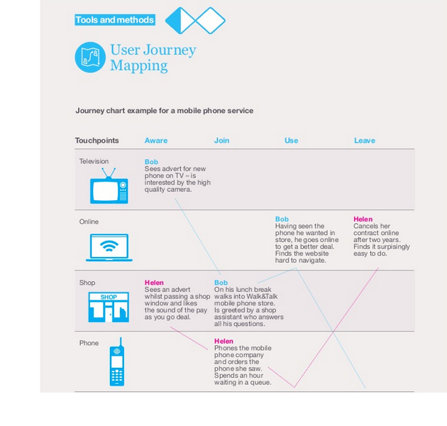
 An intern we had at Shift was working on a brief for our Historypin project (a digital platform that helps users work with people in their local community to create shared archives about their local history). She was tasked to design a toolkit of resources for local community organisers, to help them to organise better events. One of the most useful things she did was to listen in to interviews with potential users and create User Journey Maps (see page 12 in Design Methods for Developing Services) which showed how the people running events and those attending the events might become aware of a Historypin event, join up, participate, and then interact afterwards. After she designed the toolkit she could test it against this framework.
People doing it well: professional example
Apps for Good provides resources for teachers to deliver courses in designing apps that solve social problems and run a national competition to reward the best entrants. Finding out what their users want and need is crucial and so they send out a survey to all their users every six months, to gather their insights on what’s working and what’s not. They use this feedback to improve their offering.
In my next blog
I am going to write about creating solutions with User Value, Social Value and Financial Value.
>> Find out more about the RSA Student Design Awards
>> Find out more about Shift

Be the first to write a comment
Comments
Please login to post a comment or reply
Don't have an account? Click here to register.